Summary
Project Brief
Initially, the project was outlined as a website refresh but quickly we came to focus on brand transformation. After working with the client on a direction, a new name was selected and we began the work to develop the visual elements that would bring the new brand together.
Thinking about what you do and why you do it can often lead you to the realization that there is a better way to show that to your audience. This is where collaborative brand development becomes important.


Brand Development
Logo & Color Palette
Through the development process, experimenting with different shapes and elements, we landed on a concept that utilized two “J” letters in the symbol, to represent both sisters. Color variations provided for multi-channel applications.
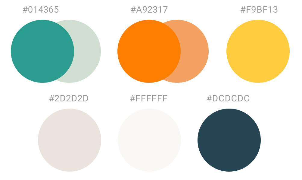
Adopting color inspiration from the original branding, we explored color palettes that went in a couple of directions. This resulted in a palette that was colorful, fun, but also modern and professional.
Website
Design
Bold Design
Highlighted the personality of the new brand by incorporating blocks of colors and angular shapes.
Animated Elements
Incorporated different types of text, icon, and illustration animations to show movement, encourage interaction.
Intuitive UX
Designed an updated site architecture for improved navigability, including the use of visual cues.
Landing Pages
Recalibrated layouts to bring more focus on formatting for stats, diagrams, and other in-content visual elements.
Brand Resilience
Developed to withstand just about any use case, the logo, colors and overall brand balance can exist anywhere.
Brand Story
Built the brand and website story to focus on how the user seeks and searches for information.
Summary
Results
With some supplemental image templates set up to support the new branding, the client was ready to introduce their new name, logo, and website.